Started from the contextual inquiry and got a grounded insights from different users about their orders placement behaviour. Most of the use cases lies in two cohorts. One is consumers and second is resellers. Meesho still wants to retain their resellers on the platform and want to double down on consumer shift which is happening.
Research
Basis on the requirement and the project understanding we have concluded user personas in two groups as below,
And figured out pinpoints for both.
Also created user persona for both users,
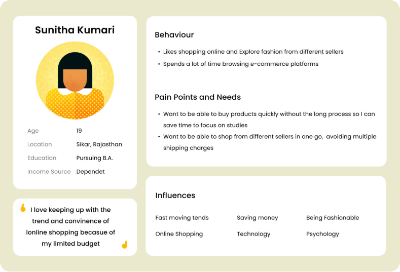
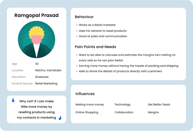
Interviewing 9 users (4 active users who have placed at least 1 order in the last 2 months, 5 pro users who have placed single order every month from last 6 months) where users have shared their preferences for the margins they add for the products and understanding for the add to cart and buy now understanding.
As not all users are from metro cities hence for some users this construct was also new to deal with. We emphasise with user in that and help them learn the concept as well during the inquiry process
Addressable problems
Margin addition for product
Comprehension of multiple suppliers product checkout
Partial serviceability
The existing flow was enough for serving resellers who are there on the platform since long. But project is about to focus more on the consumer aspects as well. Hence we documented the exiting flow as below
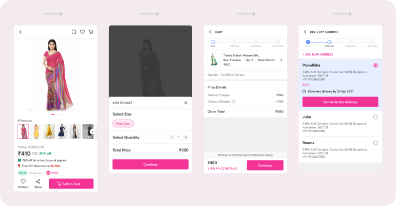

From competitive analysis of the most potential competitors in india we figured out areas we need to double down on. Major touch points in the user flows we required to fix are,
- Product Detail Page – PDP
- Cart View
- Address
- Payment Options with Margin
Solution Discovery
A lot of ideas have been coming to enhance the comprehension of the message at the same time the experience shouldn’t get compromised is what we thought while iterating on the solution discovery phase. Here are all different iterations we have tried
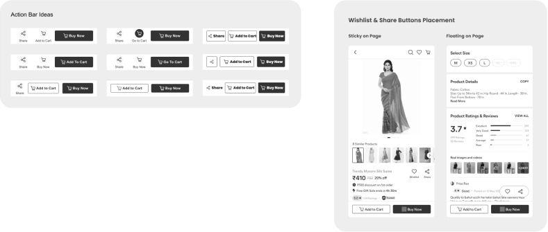
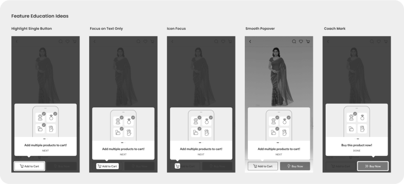

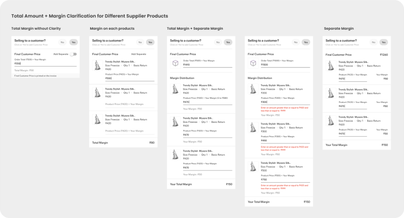
After discussing all the options with stakeholders and low fidelity test we freeze below states to move ahead. Lot of back and forth happened in the process due to the important interaction on the app which is payment. That’s where the most amount of decision happens. We can’t take it easy without enough confidence.
We concluded the solution with users insights, data and stakeholders alignment and started working on the hi fidelity screens.
Final Solution
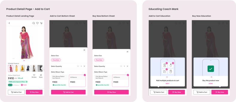


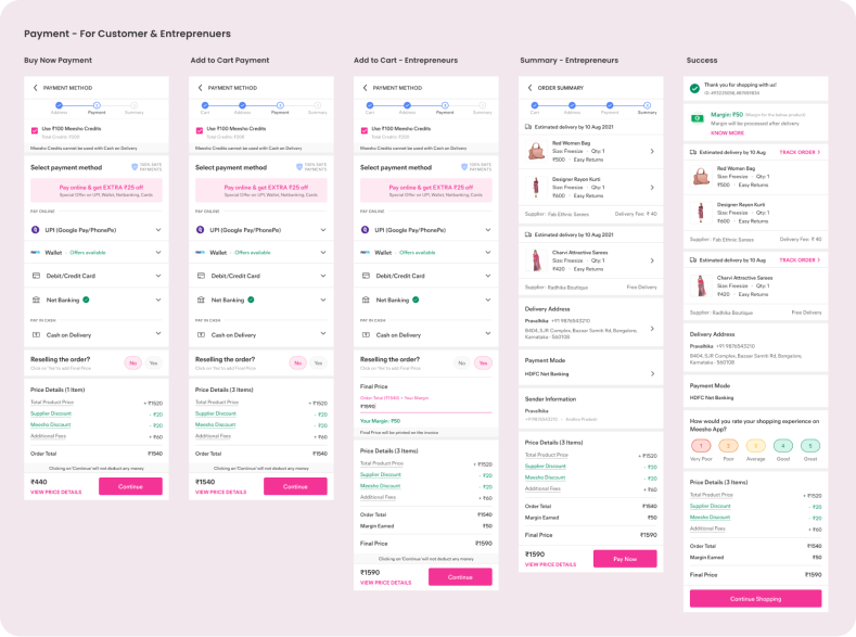
Live Versions
Conclusion
- Simplicity wins in any case if that serves the same purpose
- Data gives you the power to take some hard calls
- Leverage graphical power to communicate complex educational steps
- You have to be very clear when it comes to Payment
- All edge cases are important to solve


